
You publish 20 solid posts, add the required pages, and apply for AdSense. Then the rejection email arrives with a vague reason like “site down,” “low value content,” or “needs improvement.” The content looks fine, so you start guessing.
Often the problem isn’t your writing. It’s your AdSense navigation menu and the site structure behind it. If a reviewer or crawler can’t find your content, pages, and policies quickly, your site feels unfinished, however good the articles are.
This guide shows what a healthy menu looks like, which mistakes cause trouble, and how to fix them before you reapply.
Quick Answer
Yes, a poor navigation menu can hurt your AdSense approval. Google doesn’t reject sites for having an ugly menu. But broken links, hidden pages, confusing categories, and cluttered layouts make your site hard to use and hard to crawl. That signals a poor user experience and an incomplete site, and both work against you.
A good menu is simple, consistent, and crawlable. It lets visitors reach your main content, About page, Contact page, and policy pages in one or two clicks.
Why This Matters
AdSense reviewers judge your site as a visitor would. If they can’t understand what your site is about within a few seconds, you’re at risk.
Navigation also affects SEO. Google follows links to discover and understand your pages, and its Search Central documentation on crawlable links recommends standard <a href> links so crawlers can follow them. Menus built with scripts that don’t render proper links can leave important pages invisible.
Here’s how navigation problems show up in rejections:
- Reviewers can’t find the About, Contact, or Privacy Policy pages
- Visitors bounce because they can’t find anything useful
- Pages sit orphaned with no internal links, so they look thin or abandoned
- The site feels like a template rather than a real publication
Many beginners miss this, because a menu feels like a design detail instead of a quality signal.
What a Good AdSense Navigation Menu Looks Like
Think of your menu as a table of contents for your whole site. It should answer three questions fast: what is this site about, where is the content, and who runs it?
Keep the Main Menu Short
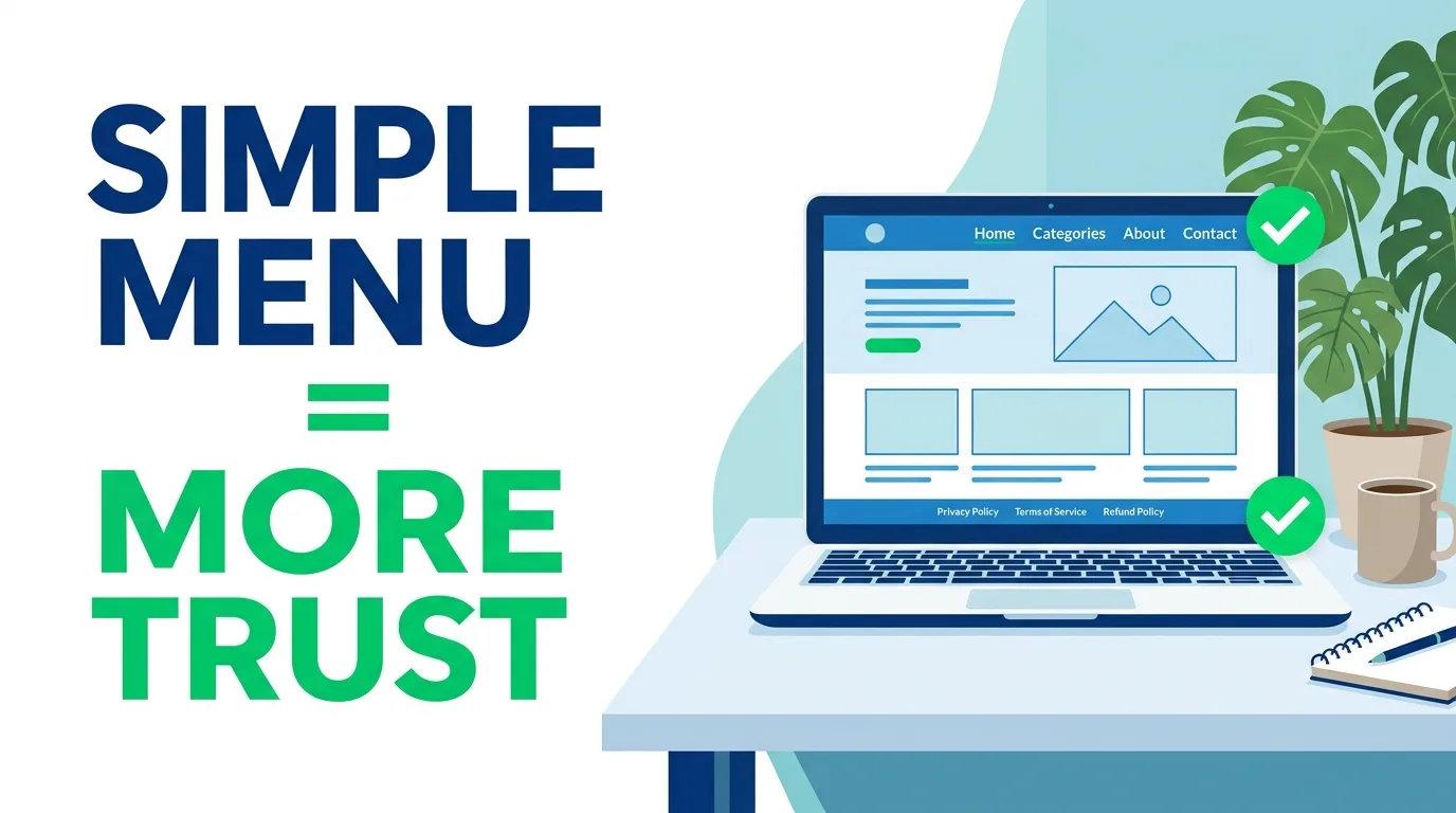
Aim for 4 to 7 top-level items. More than that overwhelms visitors, especially on mobile.
A typical healthy setup looks like this:
| Menu Location | What to Include | Why It Helps |
|---|---|---|
| Header menu | Home, 3 to 5 main categories, About, Contact | Shows topic focus and transparency |
| Footer menu | Privacy Policy, Terms, Disclaimer, Sitemap | Keeps policy pages easy to find |
| In-content links | Related posts, category links | Builds topical depth for crawlers and readers |
| Mobile menu | Same links as desktop, tap-friendly | Most reviews and traffic are mobile |
Match Categories to Your Real Content
Every category in your menu should have at least several published posts. Empty or one-post categories look unfinished.
A site covering one clear topic with four or five tidy categories reads as focused and trustworthy. A site with twelve loosely related categories and two posts each looks scattered.
Make Trust Pages Easy to Reach
Reviewers look for signs that a real person or business runs the site. Link your About and Contact pages in the header or footer, and make them substantial. Our guide on what your About Us page needs for AdSense approval covers what to include.
Your Privacy Policy matters just as much, especially if you use cookies, analytics, or ads. Put it in the footer on every page.
Use Clear, Descriptive Labels
Say “WordPress Tutorials,” not “Stuff.” Avoid clever names that hide what’s inside. Plain labels help visitors and also give Google context about your topics.
Common Mistakes
Menus full of broken or placeholder links. Links to “#” or deleted pages frustrate visitors and look unprofessional. Check every link before you apply.
Hiding important pages. If your policy pages exist but appear nowhere in the menu or footer, reviewers may assume they don’t exist.
Overstuffed mega menus. Dozens of links dilute your topic focus and overwhelm mobile users.
Menus that don’t match the content. A “Finance” tab with one post, or “Travel” on a tech blog, confuses the site’s purpose. This often feeds into the dreaded “low value content” message. If that’s your situation, read why AdSense says low value content and how it was fixed.
Navigation that only works with scripts. If your menu relies on JavaScript that doesn’t produce real links, crawlers may miss pages.
Pop-ups and ads covering the menu. Anything that blocks navigation hurts user experience and can conflict with AdSense Program policies.
Orphan pages. Posts that no menu, category, or related link points to are hard to discover, for readers and for Google.
Best Practices
Follow this checklist before you apply or reapply:
- Click everything yourself. Open every menu and footer link on desktop and phone.
- Limit top-level items. Group related content under clear categories.
- Link policy pages in the footer. Include Privacy Policy, Terms, Disclaimer, and Contact.
- Add an HTML sitemap. It helps visitors and gives every page a path. You can see how ours works on the HTML sitemap page.
- Link posts to each other. Add related-post links inside articles so no page is orphaned.
- Test on mobile first. Make sure the menu opens, closes, and scrolls without covering content.
- Keep the structure stable. Don’t redesign your whole menu in the week before applying.
If you’re on WordPress, run through the AdSense eligibility checklist for WordPress sites alongside your menu review. It covers the other readiness basics.
Does Site Type Change the Rules?
The basics stay the same, but the emphasis shifts:
- Tool or calculator sites: Make each tool easy to find and add explanatory content around it. See how utility websites get AdSense approved.
- Affiliate sites: Navigation should lead to real informational content, not just product links. Our post on whether affiliate sites get AdSense approved explains why.
- Free subdomains and Blogspot: Menu setup is possible, but other factors matter too. Check what’s possible with a free domain or Blogspot.
Fixing Your Menu After a Rejection
Don’t change everything in a panic. Audit first, fix the real problems, then wait and reapply properly. Our walkthrough on the right way to reapply for AdSense after rejection explains how long to wait and what to improve.
Not sure where you stand? Run your site through the AdSense Eligibility Checker before you submit again. It helps you spot readiness gaps early.
Pro Tip
Isty’s Pro Tip: Do a “stranger test” before you apply. Ask someone who has never seen your site to find your Privacy Policy, your Contact page, and one article on a specific topic, and time them. If it takes more than about 15 seconds for any of the three, simplify your menu and footer until each takes one or two clicks.
Frequently Asked Questions
Can a bad navigation menu cause AdSense rejection?
It can contribute. Google doesn’t list “bad menu” as a standalone reason, but poor navigation leads to a bad user experience, hidden pages, and an unfinished-looking site, all of which can lead to rejection.
How many menu items should my blog have for AdSense?
Four to seven top-level items is a safe range. Keep the structure simple and make sure each category has multiple published posts.
Should I put Privacy Policy and Contact pages in the menu?
Yes. Link them in the footer at minimum, and put Contact and About in the header if you can. Reviewers should find them within a click or two.
Do dropdown menus hurt AdSense approval?
Not by themselves. Problems appear when dropdowns are cluttered, don’t work on mobile, or are built so crawlers can’t follow the links. Use standard links and test on a phone.
Should I fix my navigation before reapplying to AdSense?
Yes, if you find broken links, hidden policy pages, or confusing categories. Fix the issues, give Google time to recrawl, then reapply.
Conclusion
Your AdSense navigation menu isn’t just a design choice, because it shapes how reviewers and visitors experience your whole site. A short, clear, crawlable menu with working links and easy access to trust pages removes a common hidden risk. Take an hour this week to click through every link, simplify your categories, and test everything on mobile. Then use the AdSense Eligibility Checker to confirm you’re ready before you apply again. If this helped, share it with another publisher and leave a comment with your menu questions.